
7 Design Ideas for the Apartment Living Room
No matter how small or big your living room space is, it is not a reason to compromise the design. Whether it be a DIY or a contracted project, it can be quite the challenge to find the ideal design of your taste in accordance with your budget. There may be rental restrictions when it comes to designing apartments but that does not mean there’s no means of styling your home. There is no need to cramp your style. Allow this article to give you enlightenment in designing your communal space.
We have seven design ideas for the apartment living room that will cater to every sense of style. This will help you decorate your first apartment providing ease and increasing the excitement of sprinkling the space with a personal touch. It can be challenging to identify where to start. But, this time, the dorm days are over. These ideas may be beyond the basics for a newbie apartment dweller but you came to the right page.
The Clean Slate
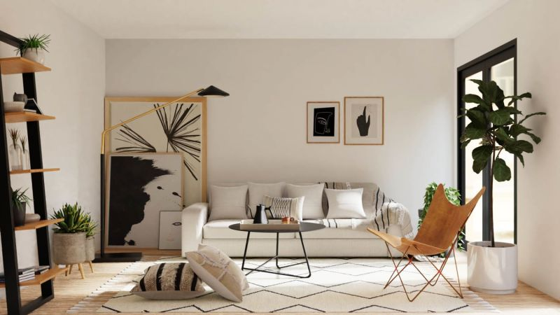
The Clean Slate is a design perfect for medium to large living room spaces. At first glance, it may seem to be cluttered when in fact, it is the coordination of the entire design. The sleek design of the solo chair and the coffee table blends well with the cozy couch. This is definitely a place you would want to lounge on after a long and tiring day at work. The wall coordination is on medium with the hanging wall arts and the wall-standing shelves. The accessories are at a bare minimum but it did not make it look simple. Instead, it made it look clean.
This is an ideal design for people who are a fan of thick and cozy textiles in different patterns but of the same tones. The warm vibe it builds maximizes its purpose of housing guests, resting on a Friday afternoon, or just for the sole purpose of entertainment. The overlays of the textiles worked well in terms of the colors and textures. The natural lighting acquired may be minimal but thanks to the light-colored eggshell-finished walls, it helps in distributing the light throughout the room.
The Mute Layers
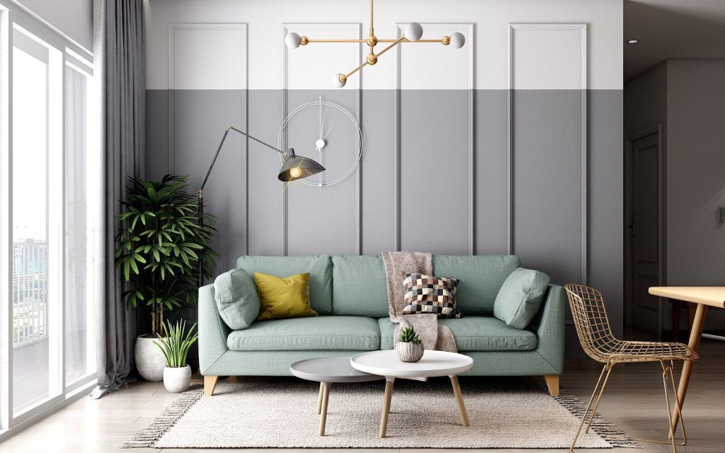
On a more feminine note, The Mute Layers is perfect for living rooms of medium to large sizes. It is a design in between contemporary and industrial design. Even though it has minimum floor-to-ceiling height, the vertical aesthetics is not compromised since most of the elements are linear. The good thing about this design is that it is a combination of mute pastels centered on the couch. There is definitely something to look at with the iconic pastel turquoise couch with the mute blanket and the overlapping colors of the pillows.
Most apartments are in an open design. This means that you can sight the entire room from the first step you take from the door. Open designs do not require walls to set as a division for every space which means the entire space will look larger and lighter. The Mute Layers design is a combination of the dining area and the living room. There may not be any sense of division but it gives a larger sitting capacity for the guests or even the household. This design is ideal if the space is limited and if you’re up for a more compact design.
The Eclectic Boho
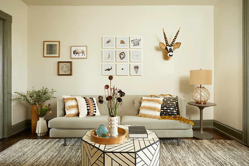
Eclectic design alone is popular in designing interiors consisting of heterogeneous elements to put into place. Whether it be the combination of textures, colors, and styles, it works well in residential spaces. On the other hand, the Boho design establishes a free-flowing personal design with the absence of rules. If you’re up for a clean-looking design, The Eclectic Boho is not the ideal design for you considering the absence of order and symmetry.
The Eclectic Boho may sound intersecting but it is a design that works if you’re up for a more personalized style. Observing the image above, what is highlighted is the use of splashing colors and patterns. It may be lacking a sense of structure but it is a more carefree design that works evidently in small and medium living rooms. The saturated tones induce warmth and coziness that will surely increase the number of hours you cave in the couch.
The Three-Tone Concept
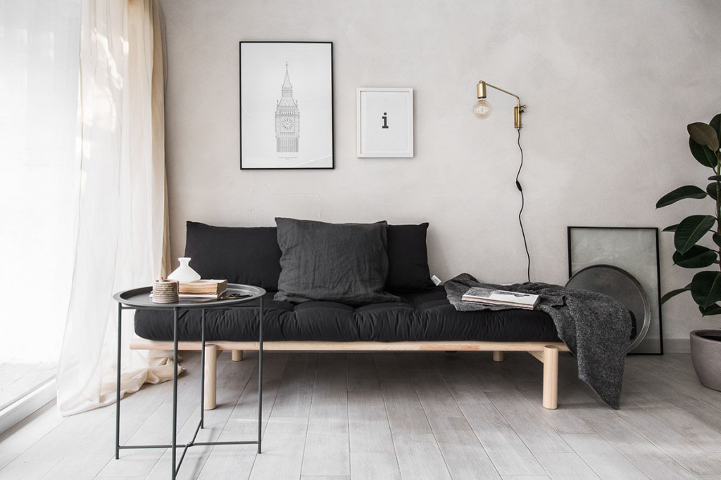
The Three-Tone Concept is a design from Home BNC channeling the minimalist industrial interior design. The great thing about having this design is how it works in any space, big or small. With the right colors, textures, and materials, space will be more expansive. It may look messy at first glance but it is a design that works evidently. The minimalist edge of The Three-Tone Concept is simple in terms of color. As you can see, there are only three colors used in different hues. The perfect overlaying for the textiles was used.
The majority of the tones may seem dark but the couch sure did highlight the textures of the flooring and the wall. The simplicity of the design is a combination of sheer and thick textiles. It makes the design pop because of the simple touches. If you’re not a fan of extravagance in design, The Three-Tone Concept is an option. It is more convenient to work on plus it is budget-friendly somehow. It is a design that looks expensive but the costs can be manageable at a minimum.
The Tropical Notch
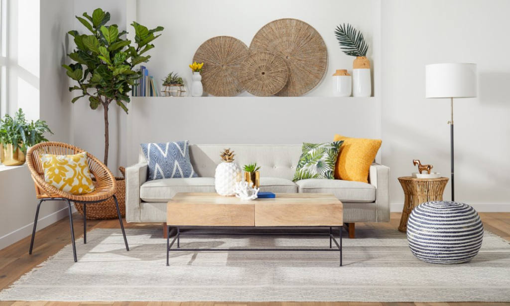
The Tropical Notch from Overstock is a design dominant with bright colors of blue, yellow, and green. The native touch from the side table, pot, chair, and wall decor creates that beachy tropical vibe. The burst of colors exhibits a crisp design that taps the view of enthusiasm and enjoyment. The combination of materials in this design never goes out of style. If you are blessed with a pre-polished white wall and large window, it’s an ideal space to fill your living room with. The tones of beiges and browns are also present framed with steel bars and wood.
The design may seem simple but the arranged elements are impactful. There’s no need for extravagant couches or fancy coffee tables. It is the colors that brought the entire design together. It was bold of the designer to mix and match the geometry of the furniture in addition to the colors. It’s a design that is not too extravagant but not too simple as well. It is in the midst of a revolutionary tropical design that will make you miss the waves.
The Outdated Scheme
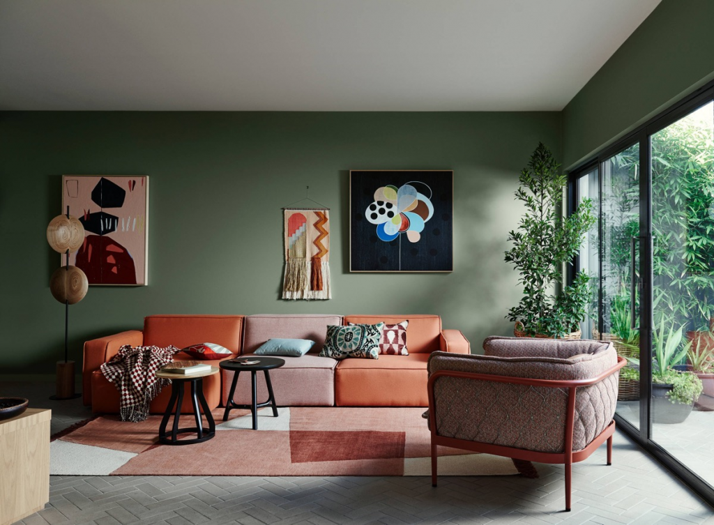
These days, people are up for the metro modern design for the living room interior. The edgy type that just lights up the room looking completely clean and in order. The design inspiration of The Outdated Scheme is a vintage retro look. There may be plenty of elements combined together but it sure did a beautiful job with the colors and materials. This is ideal for small to large living areas. It may have a touch of Boho but the vintage vibe is highlighted.
In choosing The Outdated Scheme, the first step you need to do is pick an iconic couch and a comfy armchair. Just look at how the colors on the walls are more likely to extend to the exterior properties of the living room. The tones of green and brown are overlaid and highlighted because of the light-colored flooring giving it a rustic touch. In addition, nothing beats the abstract wall art arranged accordingly in colors lacking the color of the pale olive wall. It can be a challenge for some to work with vintage touches but it would be best to start with the couch and work your way down to the textile types.
The Scandi Industrial Vibe
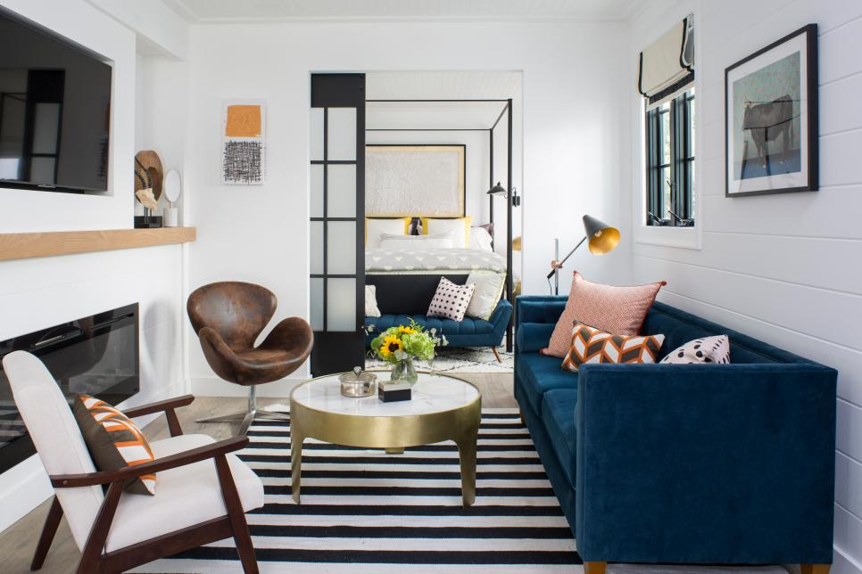
For your next apartment’s living area, a sprinkle of class and extravagance would do the trick. The Scandinavian style is often mistaken for grandeur designs in large living areas. Who knew it can work with a compact living area? As you can see in the image, different textiles are used to spice up the plain and sleek textile preference. From the patterns and textures of the textiles, it can be easily identified as something that can work together. The suede deep cerulean textile for the upholstered couch complements the leather chair and the sleek armchair.
The Scandi Industrial Vibe is a design by HGTV with the absence of an open design. The walls on the four corners give them an opportunity for hung wall arts and accessories. The opportunity for natural lighting may seem limited but thanks to the white-colored wall and paneling, it turns out to acquire more light. When it comes to Scandi design, all it takes is to look for a piece that is not like the others. In this case, the gold-plated coffee table. It wouldn’t seem to be a piece that would fit the design perfectly but just look at how it turned out.