
9 Red Living Room Ideas
Red is the color of passion, intimacy, blood, and life. With all the different hues of red, it can spice up the living room in no time. Whether it be the dominant or accentuating color, red has a powerful impact that draws attention to the room. When used right, it has an impactful aura that will make it a perfect color scheme to choose. If red is your favorite color and you are looking for inspiration for your next remodel, allow these nine red living room ideas to do the trick.
- The Classics
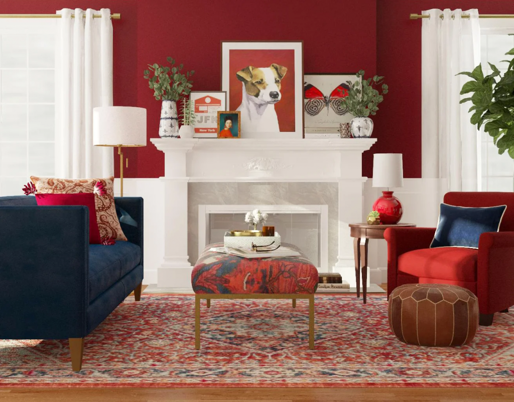
If you want to be all out with the walls, painting it red can be a bold move. What better way of adding flavor to the living room than using complementary colors? Thanks to this inspiration from Modsy Blog, they used the traditional color scheme of red, blue, and white. As you can see here, this concept is a metro contemporary view of a living room. From the arrangement of the furniture to the placement of the fireplace, the color palette embellished the theme well. If you do not want the color red to go too strong, one way of doing so is by combining it with another color. This way, it will balance out the strength of the colors. The color white was used as a neutralizer to prevent the room from being too dark for the eyes to take. A key tip would be to pick two additional colors that you think would complement red alongside.
- Smoking Red Hues
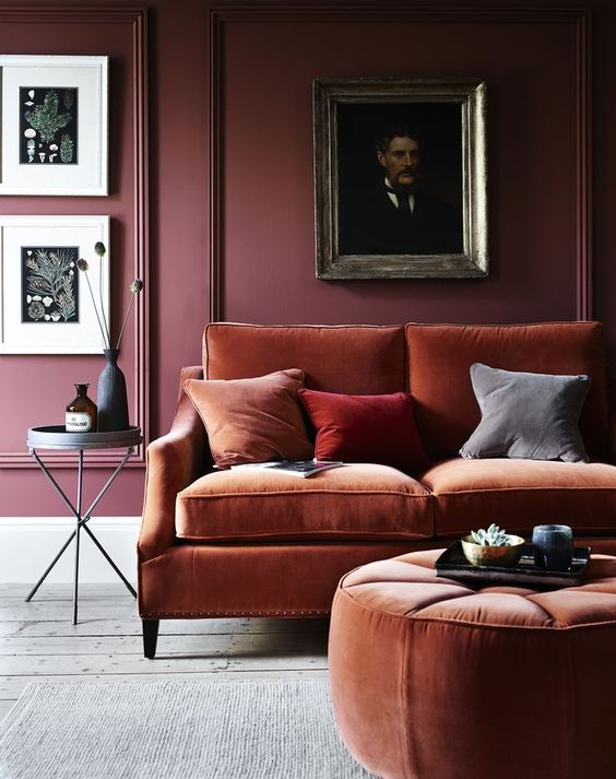
If you want to indulge in the darker and more intimate side of red, this is the perfect living room inspiration for you. We love what Real Homes did here. These blush hues of scarlet and plum made it cozy and comfortable to lounge in. The rusty shade of scarlet added a vintage vibe to the living room. Thanks to rustic wood flooring panels finished in white, it balanced the saturated tones of red. Not because it is called a red living room does not mean it should be as red as a cherry. It is more exciting to explore its different shades. In this case, plum and scarlet. This modern Victorian concept gave dignity to the preferred color scheme. A key tip is to explore colors that you think would not fit. Sometimes, putting them together looks better than the traditional palette colors.
- Contemporary Chic
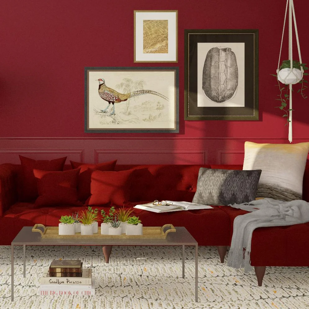
If you want to keep it bold and torrid, maybe this idea from Modsy Blog is what’s best for you. By the looks of it, the hues of the color are pretty close. The walls are in bold lipstick red and the sectional couch is in deep garnet red. To add flavor, the wall decor neutralized the warmness of the hues of red used. The overlaying of colors did not allow them to not be visible. To balance out the dark hues, it is the crocheted flooring material in white that highlights the walls and the couch. This Scandi-Contemporary design in hues of red is a perfect living room design for households with small or large spaces. A key tip in designing red living rooms is to add decorations that you think would highlight the red walls or furniture.
- Complementing Hues
If you are not a fan of red walls but you want red to be the dominant color of your living room, this is the design inspiration perfect for your preference. Red is an impactful color that can make your living room look feisty. In this inspiration from Castorina, the crimson couch is the design statement. We love the curves and the sleek suede material upholstered perfectly. Everything seems so soft and subtle. Thanks to the layer of the fluffy blanket in white, we can feel how cozy it made it look. By the looks of it, with the right lighting, it is a place where you can be intimate with someone. It is a place where you want a private candlelit dinner with your loved one. A key tip is to not forget the details. In this case, it is the standing feathers, blanket, wall arts, and lighting feature.
- Red Lipstick
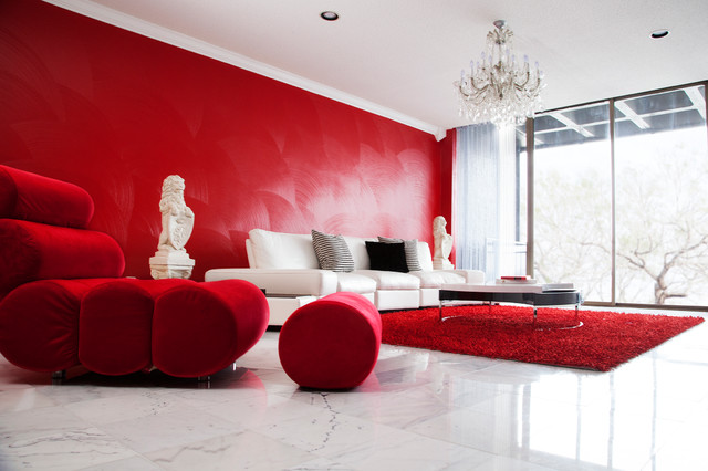
If you want to settle with a three-tone design, this inspiration from Houzz will satisfy your preferences. We love how this living room is sectioned into two. A solo-seating area and an area designated for guests. To highlight the lipstick red color, they painted the walls in full. What made the details highlight is that they utilized a painting technique exhibiting curvature. Next to the wall is the massive white leather couch. The details in this design are very subtle. But, the accessories managed to fill in the void. To accentuate the living room design, the designers opt for a cylindrical lazy chair on the side. This is perfect for solo nights alone after a long and tiring day. To balance out the lightness of the marble flooring, a carpet of the same shade was used. A key tip is to balance the plaid and patterned elements.
- Candy Cane
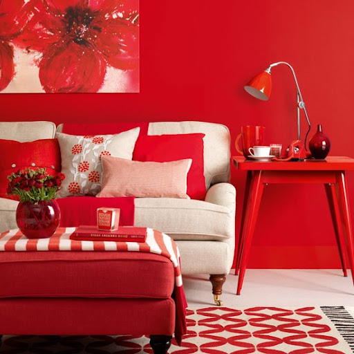
This candy cane-like design from Finishing Touch Interiors is a sweet concept for a red living room. If you do not want to complicate the design, it is best to settle with a straightforward design. It was bold of the designer to use the same shades of cherry red. It is sweet and sleek that made the palette look like a candy cane. The off-white couch and the white polished concrete flooring alleviated the saturation of the dominant color. There are plenty of patterns used but the design was able to pull it off. Working on a color with the same shade is perfect if you want a sweet and accentuating two-tone design. As we focus on the details, we can see how it looks neat and in order. A key tip is to pick your preferred shade of red and pair it with a light color and materials.
- Scarlet Farmhouse
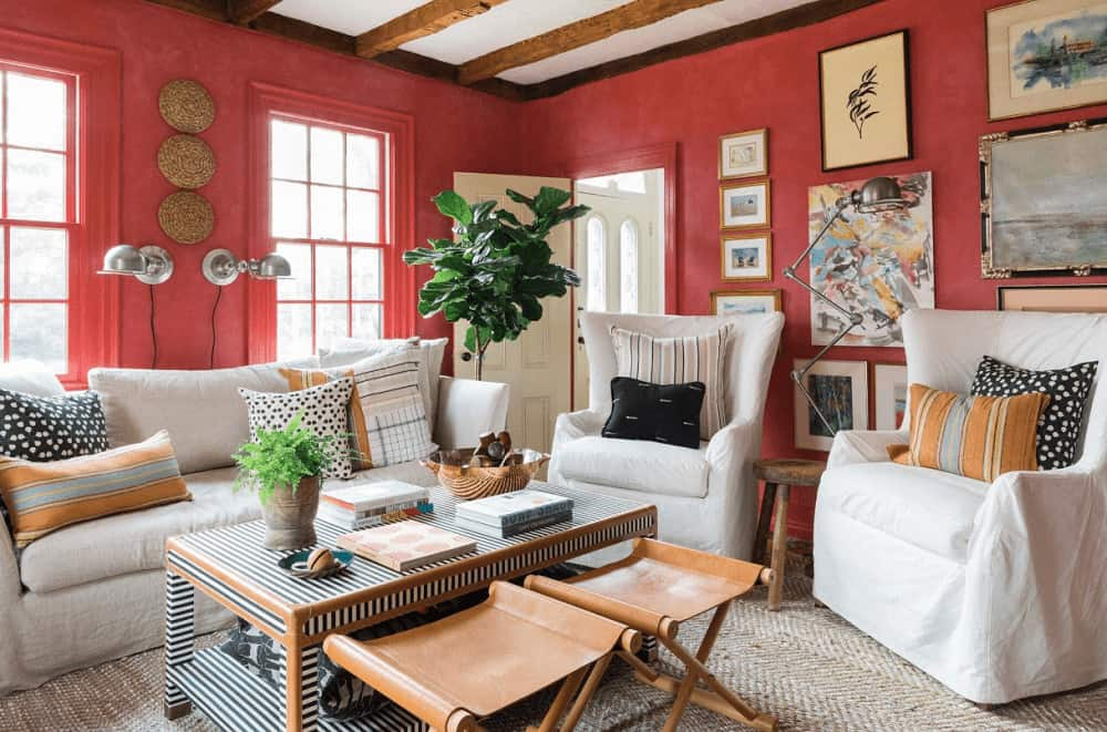
If you are a fan of old and traditional designs, this scarlet farmhouse would suit your taste for design. Thanks to this inspiration from Home Stratosphere, it made us realize that there are plenty of hues and tones of red to work with. In this case, it is scarlet that serves as the dominant color. We love the combination of scarlet, white, and brown. The design made the living room comfier. It is definitely a safe space where you want to lounge and bond with the rest of your family. The color of a room reflects the identity of the household. It seems jolly and outgoing, by the looks of it. If you are not a fan of the bold colors of red, these red-orange-painted walls will do the trick. It is a concept with plenty of patterns and details you can never go wrong with a scarlet living room. A key tip for this living room concept is being okay with an additional warm color. In this case, the color brown.
- Plush Living
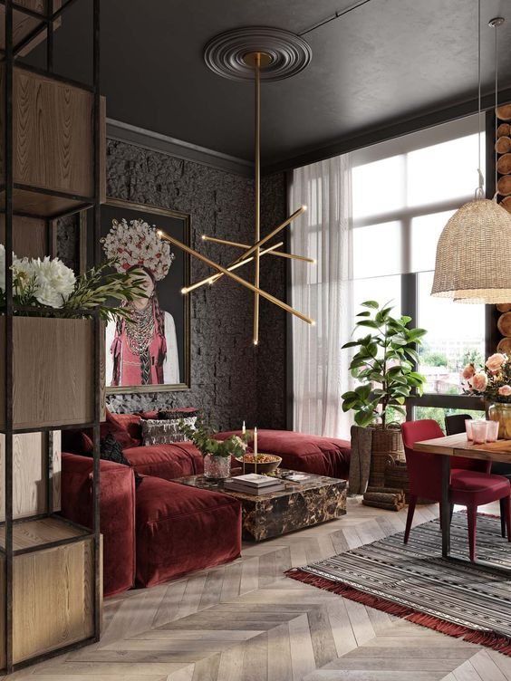
If you are up for a luxurious red living room, Home Designing’s design inspiration will surely top your preferences. We love how the different textures used managed to blend and complement one another. In spite of the small living room space, the wine red suede sectional couch fits the space perfectly. Because of its smooth and sleek upholstery, it made it more sophisticated and intimate. We love the marble coffee table in the center. With its black and gold color, it highlighted how grand the entire room is. For the accent wall, instead of using a typical wood cladding, the designers opt for a rustic concrete cladding in deep warm grey. To top off the red living room, an industrial lighting chandelier was used. There are just too many patterns and textures that the designers opt for a simple yet sleek lighting fixture. A key tip in designing red living rooms is to be consistent with the elements you are to choose.
- Fruity Palette
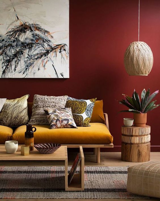
We love the tropical punch vibe of this design concept from Shake utilizing a fruity palette. The combination of red, yellow, and orange in different hues made it look like a fruit punch. It is juicy and sweet. The matte merlot-colored walls are very stunning to look at. Decorated with a light-colored wall art accentuates with the color palette preference. The use of wood to add texture and detail to the room. They believe opting for wood will complement the warmness of the color preferences. To keep the redness at a minimum, they paired the walls with a yellow-orche couch. It created this rusty modern vibe. Its vibrance of the colors is balanced out preventing overdoing the design. A key tip is to take risks when it comes to choosing building materials that you think will highlight your color preferences.